Free Resources

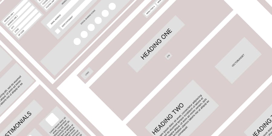
Responsive Wireframes
A set of responsive wireframes for a typical company home page to demonstrate Figma's auto layout capabilities across five common screen breakpoints (1440px+, 1440px, 1024px, 744px, 375px). Please note that these are for demonstrative purposes and user-centred research should always be carried out prior.

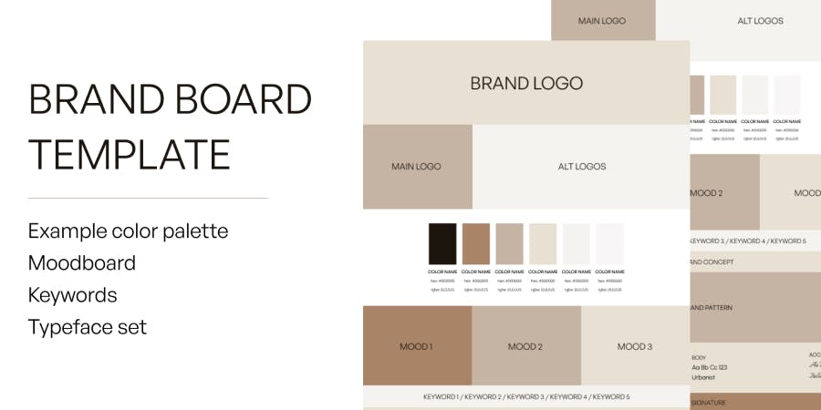
Brand Board Template
A set of responsive wireframes for a typical company home page to demonstrate Figma's auto layout capabilities across five common screen breakpoints (1440px+, 1440px, 1024px, 744px, 375px). Please note that these are for demonstrative purposes and user-centred research should always be carried out prior.

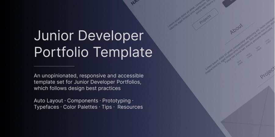
Junior Developer Portfolio Template
An unopinionated, responsive Junior Developer Portfolio Template, covering 1440px+, 1440px, 1024px, 744px and 375px breakpoints with UI Prototyping for mobile and tablet menu toggling, auto layout for responsive adapting to viewport width changes, components and prototyping to emulate typical user flow and interaction, accessible color palette examples (complying with WCAG 2.1 Level AA and AAA standards), typeface examples (Serif and Sans Serif Google Fonts) and tips, advice and resources.
Available for agency and freelance work